
The Energy Collective Group
This group brings together the best thinkers on energy and climate. Join us for smart, insightful posts and conversations about where the energy industry is and where it is going.
Post
Graphical Disinformation - Intended to mislead.

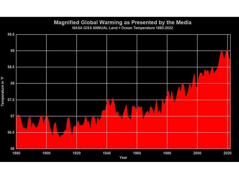
The most common graphical presentation regarding global warming, or climate change, is the graph of the increasing temperature anomalies beginning in the late 1800s. The graphs below, created by Anthony Watts for the Watts Up With That website convert that data from anomalies expressed as °C to actual temperatures in °F. The upper graph uses a truncated “Y” axis with a temperature range just slightly larger than the range of the temperature change over the period, maximizing the perception of the temperature change.
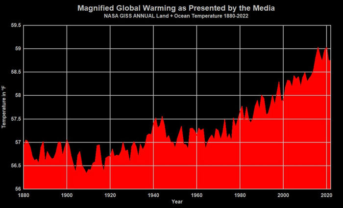
The lower graph plots the same temperature data using a “Y” axis with a temperature range representative of a typical mid-latitude location (-20°F to +120°F). The temperature change over the period is still visible on this scale, but appears far less impressive or concerning than in the upper graph.
NASA GISS 1880 – 2022 | Anomaly vs. Absolute Temperature Source: Anthony Watts
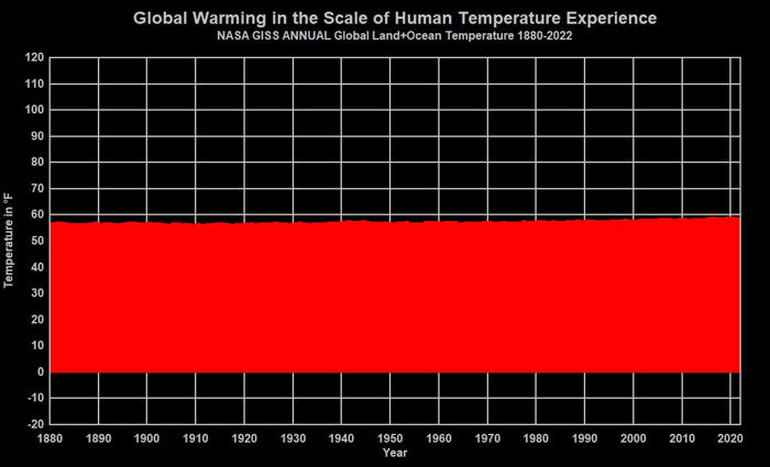
The graph below originated on the Powerline blog and has been modified here with the addition of the red and blue bands representing the average diurnal temperature ranges for the peak summer month (July, red) and peak winter month (January, blue) in Wichita. This allows comparison of the global average annual temperature change over the period from 1880 through 2015 (~1.6°F) with the average diurnal and peak seasonal temperature changes in Wichita. Note that the chart temperature range is from -10°F to +110°F, slightly lower than the -22°F to +114°F record temperature range for Wichita.
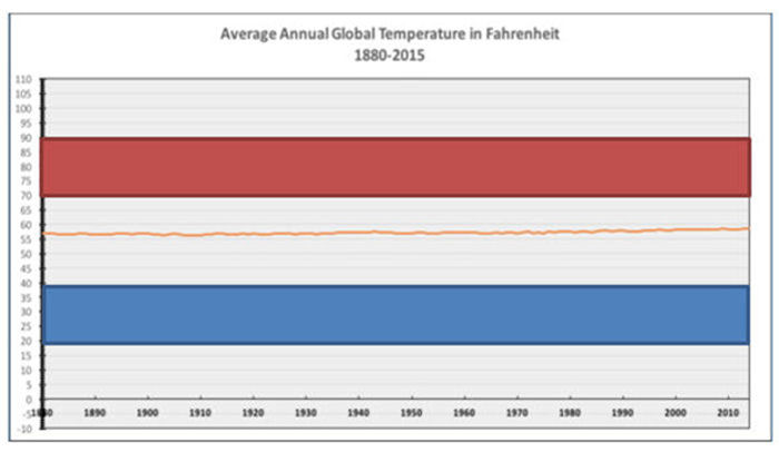
Again, the temperature change over the period is visible on this scale, but pales in comparison to the typical diurnal temperature ranges, no less the record high and low temperatures for the reference location.
The next set of graphs show the change in the Greenland ice mass, on the left using a truncated “Y” axis to emphasize the scale of the ice loss and on the right showing the same ice loss relative to the total Greenland ice mass. Showing only the left panel conveys a severely distorted impression of the situation.
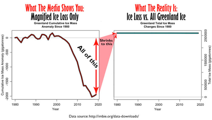
A comparison of presentations of satellite data capturing Greenland’s ice mass loss. The image on the right shows changes in Greenland’s ice mass relative to Greenland’s total ice mass. Sources: The data plotted in these graphs are from the Ice Sheet Mass Balance Inter-Comparison Exercise, a joint exercise by NASA and the European Space Agency.4 Graphs originally by Willis Eschenbach. Adapted and annotated by Anthony Watts.
The graphs below are perhaps the most egregious example of graphical disinformation. In this case, data are available from 1926, showing a dramatic decline in acres burned over the period through 2020. However, by selecting a truncated “X” axis ranging from the lowest point in the area burned data (1983) to 2020, the lower graph conveys the impression that there is a significant upward trend in area burned. This is done to create the impression that climate change is contributing to, or perhaps causing, the increase in area burned, while the area burned was far higher before climate change might have been an issue.
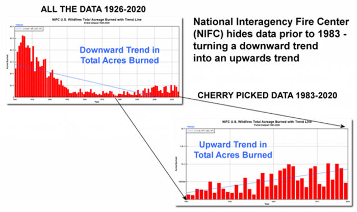
A comparison of the before and after erasure NIFC dataset showing acres burned. Note the blue trend line goes from a negative trend to a positive one when cherry picked data is used. Source: Anthony Watts
Graphs can be an extremely useful tool in conveying information, but they can also easily be used to create disinformation or a distorted impression regarding a situation.
Discussions
No discussions yet. Start a discussion below.
Get Published - Build a Following
The Energy Central Power Industry Network® is based on one core idea - power industry professionals helping each other and advancing the industry by sharing and learning from each other.
If you have an experience or insight to share or have learned something from a conference or seminar, your peers and colleagues on Energy Central want to hear about it. It's also easy to share a link to an article you've liked or an industry resource that you think would be helpful.


Sign in to Participate